WAI-Illustrious v17 hands-on: hires fix auto-corrects hands and feet, 4 rating tags, do v16 LoRAs still work?
 Contents
Update (2026-04-25): Published a follow-up at Training a LoRA for $1 on RunPod with a CPU Pod + GPU Pod Two-Stage Workflow — retrained the same character at dim=16 on this v17 and compared face fidelity against the v16-trained LoRA.
I tested WAI-Illustrious SDXL v17 on M1 Max 64GB ComfyUI against v16 with the same seeds. The headline is automatic hand/foot correction during hires fix — it works, and it changes how aggressively you can generate without post-touching limbs. The four rating tags (general/sensitive/nsfw/explicit) still matter, and v16-trained Kanachan LoRAs (04/05) carry over but not perfectly. WAI0731 had shipped the experimental derivative WAI-Anima v1 just before this, so the main IL line and the Anima derivative were evidently being pushed in parallel.
Model info
| Field | Value |
|---|---|
| Model | WAI-NSFW-illustrious-SDXL v17.0 |
| Base | SDXL (Illustrious derivative) |
| Filename | waiIllustriousSDXL_v170.safetensors |
| Size | 6.5GB |
| VAE | Baked in |
| Where to get it | CivitAI.red, Tensor.Art |
v17 lives on CivitAI.red rather than CivitAI.com, due to content policy changes on the CivitAI side. Searching CivitAI.com doesn’t surface it; users get redirected to the red side. Roughly speaking, the red side is positioned as “the overflow space for NSFW-leaning content.”
v17 changelog (per the model page)
- Fixed cases where certain characters’ tones didn’t match the background
- Improved backgrounds that had low relevance to the character
- Coloring overall is a bit smoother and cleaner than v16
- Improved the hires-fix limb correction rate (arms, legs, hands, feet tend to self-correct)
- If you don’t like the default character age, prepend
(aged up:1.0-2.0)or(mature female:1.0-2.0)and tune as needed
Recommended settings vs pre-v11
The recommended numbers have dropped; you can get good quality with lighter configurations now.
| Setting | v15-v16 | v17 |
|---|---|---|
| Steps | 25-40 | 15-30 |
| CFG | 5-7 | 5-7 |
| Sampler | Euler a | Euler a |
| Recommended software | forge / forge-neo | forge-neo |
| Recommended size | 1024×1024 or larger | 1024×1024 or larger (example uses 1024×1344) |
| Hires upscale | 1.5 | 1.5 |
| Hires steps | 20 | 20 |
| Hires upscaler | R-ESRGAN 4x+ Anime6B | R-ESRGAN 4x+ Anime6B |
| Hires denoise | 0.35-0.5 | 0.35-0.5 |
The four safety rating tags (general / sensitive / nsfw / explicit) and the positive/negative prompt templates on the model page are unchanged since v11.
Test environment
| Field | Value |
|---|---|
| Machine | MacBook Pro M1 Max / 64GB unified memory |
| Runtime | ComfyUI 0.16.4 (MPS) |
| PyTorch | 2.10.0 |
| Python | 3.13.11 |
| Steps | 28 |
| CFG | 6.0 |
| Sampler | euler_ancestral |
| Scheduler | normal |
| Resolution | 832×1216 (portrait) / 1216×832 (landscape) / 1024×1024 (square) |
| Seed policy | Fixed per test; same seed across compared pairs |
| Negative | bad quality, worst quality, worst detail, sketch, censor (add , nsfw when filtering NSFW) |
| Time per image | ~66 seconds raw, ~127 seconds with hires fix |
Prompts follow the IL / Danbooru convention: subject → appearance → pose → background → meta (quality tags). Later in the article I also compare with the “quality tags first” format (the naive-copy-from-the-model-page placement).
The NSFW activation comparison is split out as an optional “bonus” section at the end of the article. The raw NSFW shots are gaussian-blurred for Google’s sake, but composition, color, and pose remain discernible.
ComfyUI node layout (for reference)
Not the main point, so kept brief. The workflow is minimal.
CheckpointLoaderSimple → (LoraLoader) → CLIPTextEncode (positive/negative)
                                      → KSampler ← EmptyLatentImage
                                      → VAEDecode → SaveImage
For hires fix, the KSampler output goes through LatentUpscaleBy (1.5x, nearest-exact) and then a 2nd KSampler (denoise 0.4, steps 20) using the same model and prompt. R-ESRGAN 4x+ Anime6B is the official upscaler, but I didn’t have that model locally so Latent Upscale was used instead.
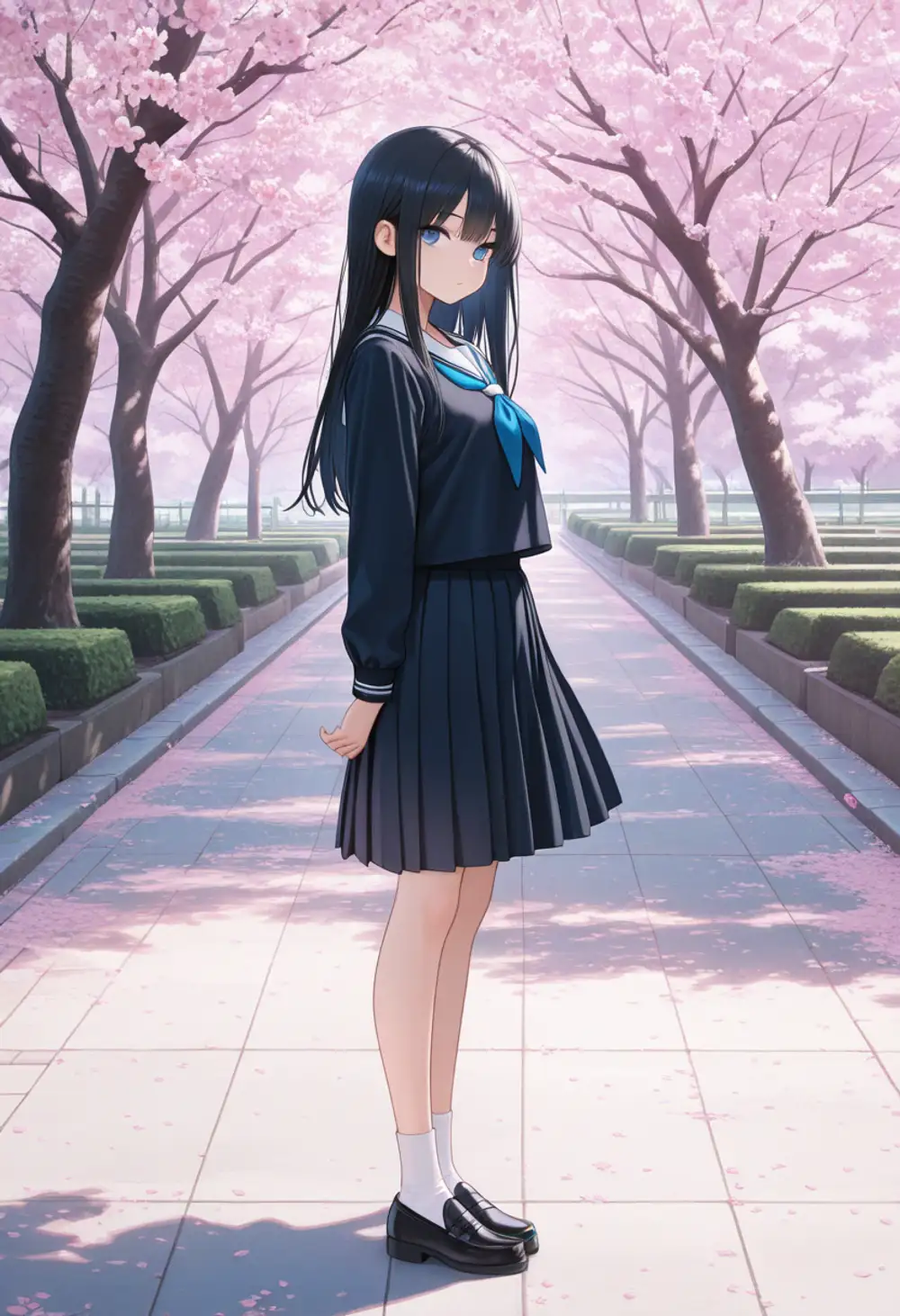
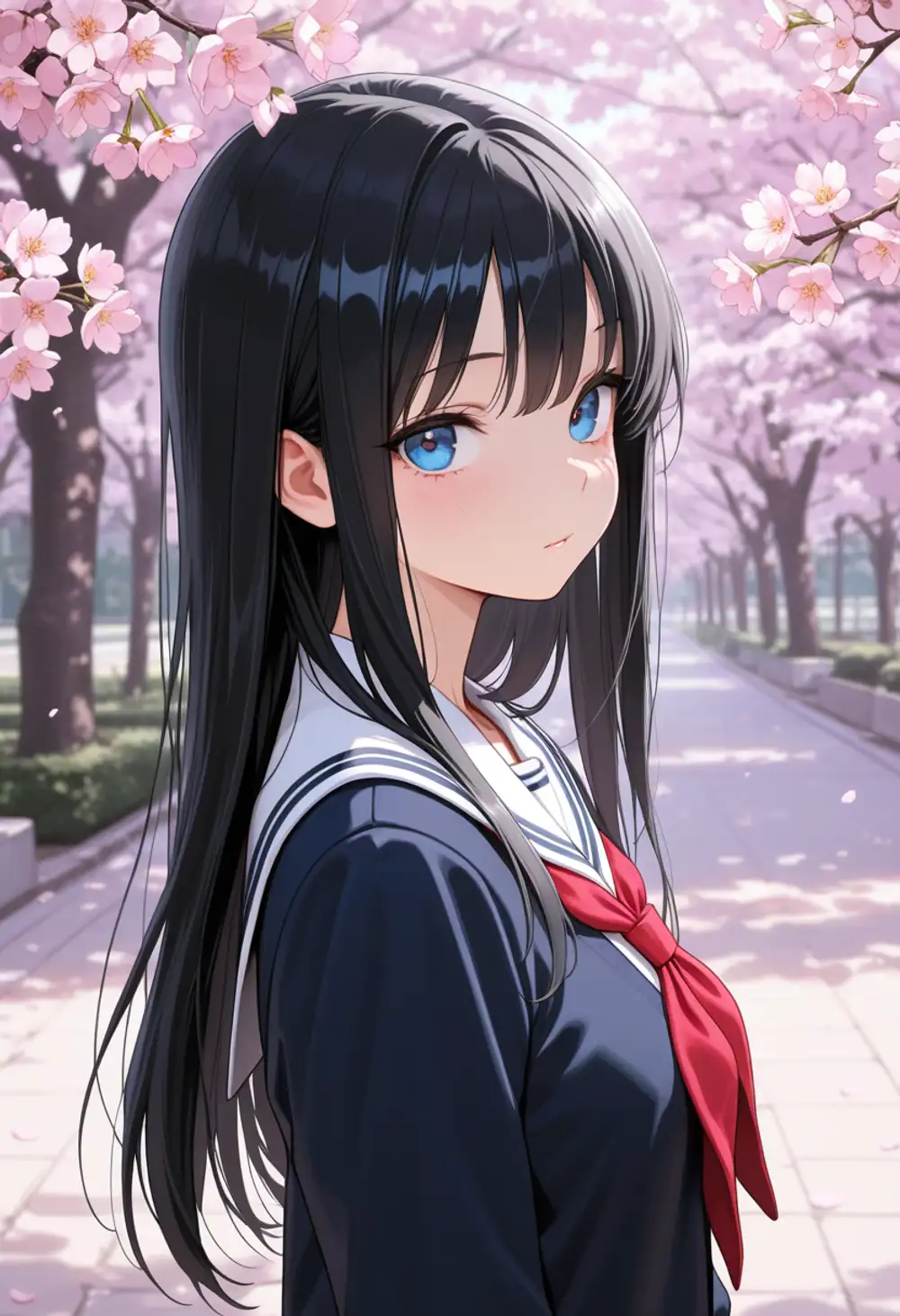
Base quality comparison (v16 vs v17, same seed)
Bust-up shot
Prompt: 1girl, solo, long black hair, blue eyes, school uniform, looking at viewer, upper body, cherry blossom, outdoor, spring, masterpiece, best quality, amazing quality
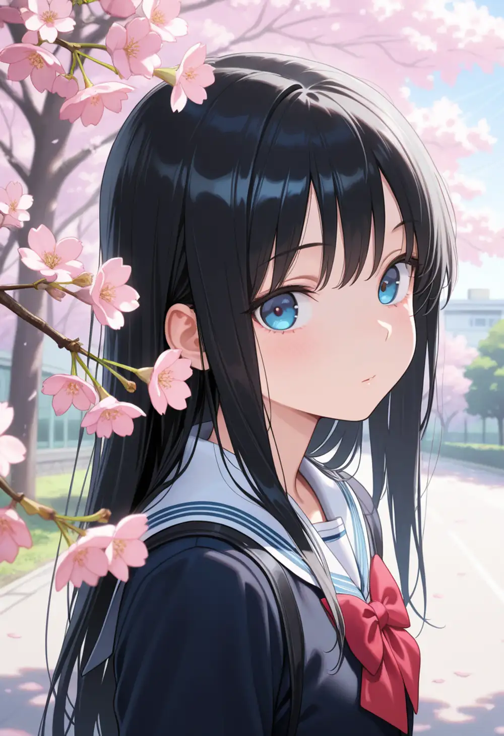
Since the seed and prompt are identical, pose, expression, hair, and uniform are nearly the same. The difference is in how the background is handled.
In v16, cherry blossom branches clumsily overlap the foreground, and the character-background relationship looks cluttered. v17 cleans up what the release notes call “backgrounds with low relevance to the character” — the cherry blossom row recedes into the distance cleanly. The petal density is also pulled back, which lets the subject breathe.
Facial rendering quality is high in both, but v17 has smoother contrast and cleaner skin gradients. Hair highlights are also sharper in v17.
Full body (wide shots are often said to fall apart in IL-family models)
Prompt: 1girl, solo, long black hair, blue eyes, school uniform, standing, looking at viewer, full body, cherry blossom, outdoor, spring, masterpiece, best quality, amazing quality
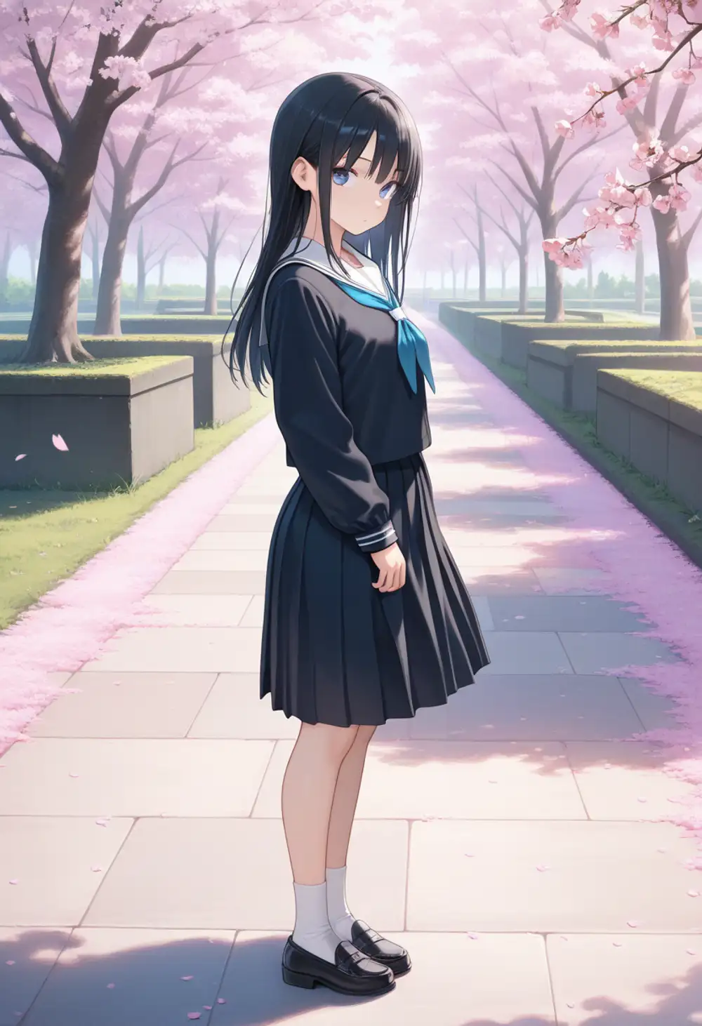
Both are sideways standing poses with no limb breakage. The usual IL complaint that “faces collapse at full-body distance” doesn’t manifest in either version for this prompt. The face is at a 3/4 angle and small enough in frame that expression differences are hard to judge from this single cut.
The difference in color palette and atmosphere is clear: v17’s cherry blossom row has more depth, and the stone pavement, hedgerow, and bokeh on the petals all tie the frame together. Pleated skirt, loafer, and sock details are also a step up in v17.
Dynamic pose
Prompt: 1girl, solo, long silver hair, red eyes, black dress, dynamic pose, jumping, action, wind, looking at viewer, full body, sunset, outdoor, masterpiece, best quality, amazing quality
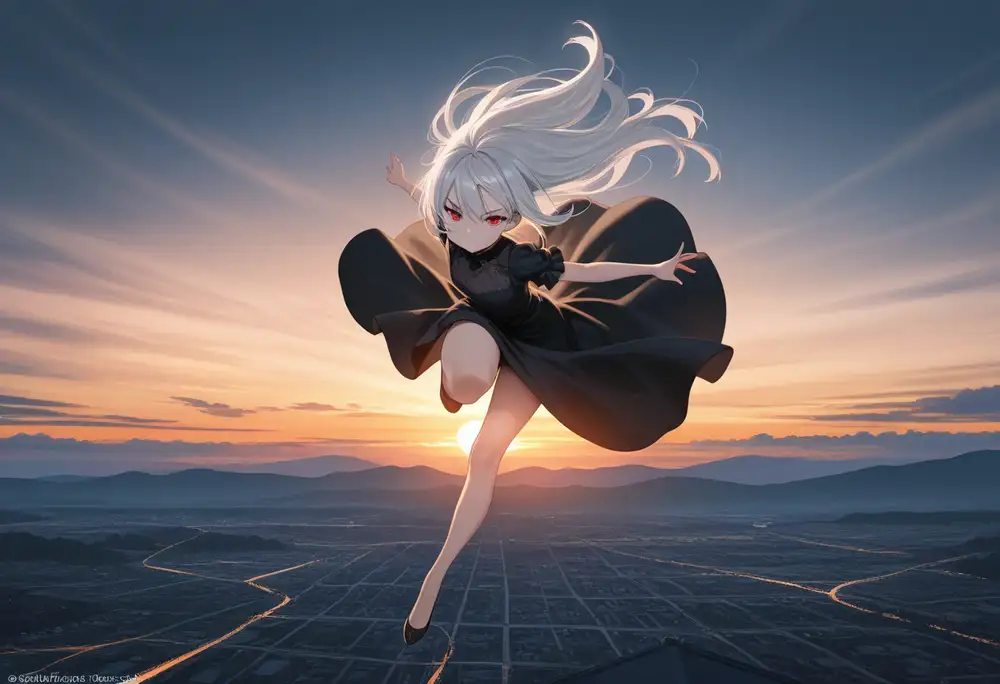
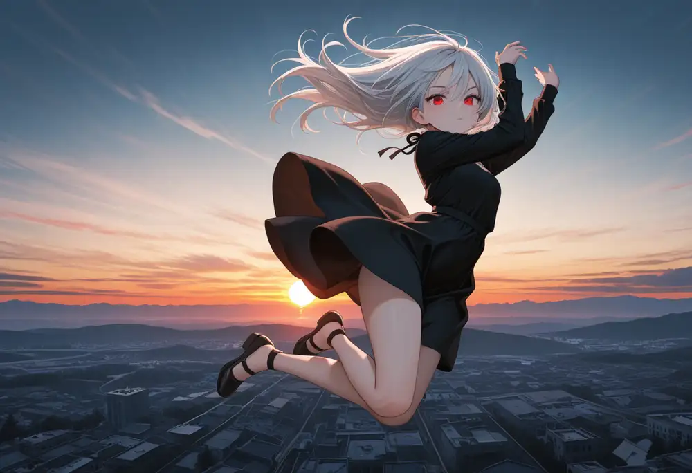
The jump direction differs substantially between v16 and v17 despite the same seed. v16 goes for an upward jump with a horizon sunset backdrop. v17 goes for a lateral action jump with a cityscape spreading out below. v17 picks more dramatic compositions and is more visually striking.
Background render quality also differs. v16’s ground texture is ambiguous enough that “rice paddy fields” wouldn’t be an unreasonable first impression. Looking closely you can see it’s attempting an aerial view of a city, but the building outlines are too melted to parse. v17 shows clear building facades and street lines.
Footwear is also different: v16 picks a ballet-shoe-style slim strap, v17 picks a heeled sandal with thin straps wrapping above the ankle. Even with the same seed, v17’s model weights interpret the initial noise differently. v16 and v17 are best treated as distinct models, not drop-in replacements.
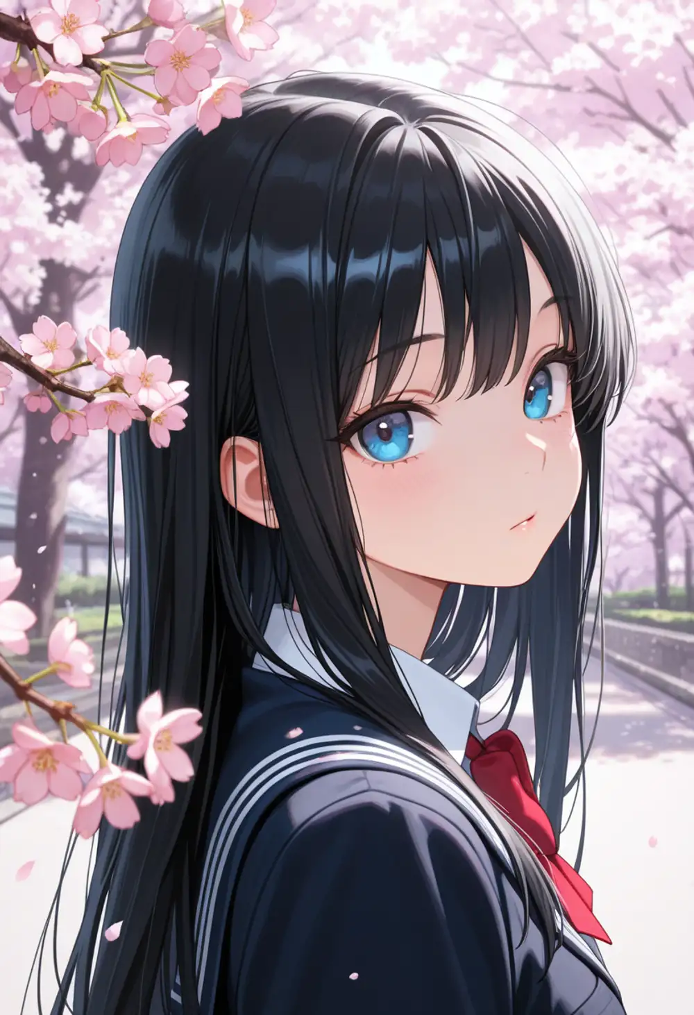
Prompt ordering also has a significant effect
On the side, here’s what the A1 bust-up (v17) looks like when only the prompt word order changes. Same seed, same vocabulary, only the position of the quality tags differs.
The quality-first version keeps the heavy cherry-blossom foreground cut-in from the earlier shot, and the composition feels cluttered. The quality-last version opens up the face region and lets the background bokeh do the heavy lifting. Same seed, same vocabulary, yet the overall impression shifts this much.
The Positive Prompt sample pasted on the WAI model page reads ,masterpiece,best quality,amazing quality, — with a leading comma.
This signals “append this after the user’s prompt,” i.e. it’s meant to be used with the quality tags at the END.
The Negative side reads bad quality,worst quality,worst detail,sketch,censor, — with a trailing comma, meaning it’s a prefix snippet the user can append to.
So the WAI format and the IL / Danbooru tag-order convention (meta tags go last) actually point the same way: quality tags at the end is the correct placement. On my first run I pasted them at the front without noticing — that’s the left image above. Reading the comma placement carefully makes this obvious, but other people probably hit the same mistake, so I’m keeping the comparison in. Every comparison image in this article (outside of the initial batch) uses the quality-last convention.
The 4-tier rating tags
The Illustrious family has a four-level safety rating tag baked into its training data.
| Tag | Meaning |
|---|---|
general | Fully SFW, no exposure |
sensitive | Light exposure like swimsuits or underwear |
nsfw | Nudity |
explicit | Sexual depiction |
The model page states: “Users are expected to consciously add nsfw to negative prompts to filter inappropriate content.”
What happens if you put it on the positive side instead?
I kept the seed fixed and swapped only the trailing rating tag.
Prompt: 1girl, solo, long brown hair, swimsuit, standing, looking at viewer, beach, {rating}, masterpiece, best quality, amazing quality
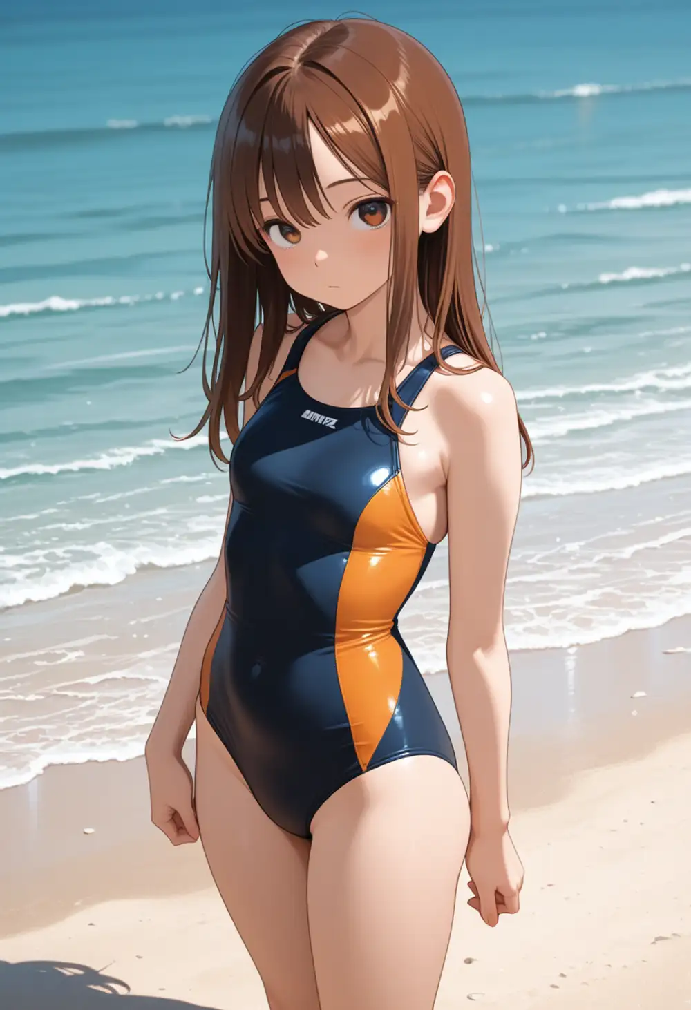
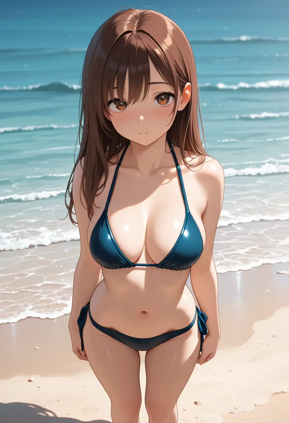
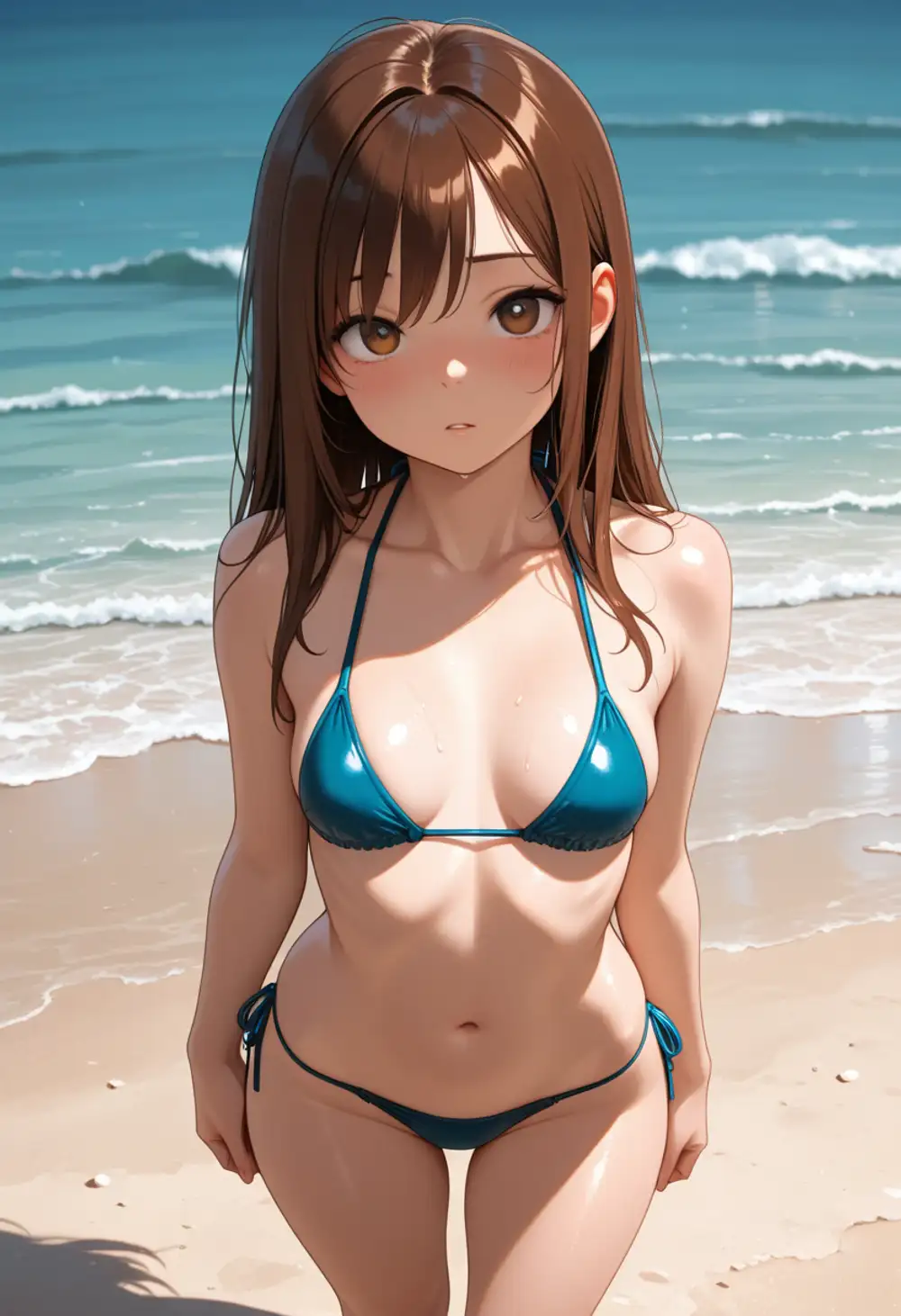
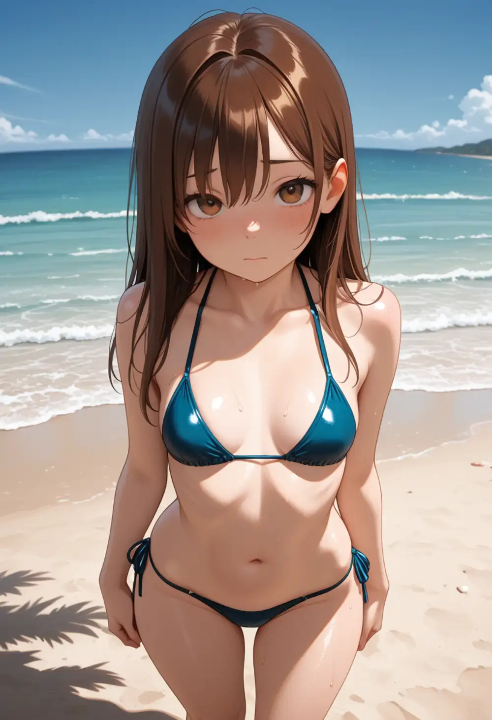
general→ school swimsuit (competitive one-piece). Swings toward minimum exposuresensitive→ switches to a bikini. Keeps theswimsuitvocabulary but picks a more revealing shapensfw→ still a bikini. Slight composition change at mostexplicit→ still a bikini
As long as swimsuit is in the prompt, the rating tag alone won’t undress the subject.
The tag functions as a “which side of the swimsuit spectrum to pick” hint, nothing more.
The general→sensitive boundary is crisp, but nsfw→explicit shows almost no visible difference in this prompt’s range.
The model page’s recommended use — nsfw on the negative side for filtering — is the more meaningful application.
The positive-side effect is just a fine-tuning nudge.
Kanachan LoRA matrix (04 / 05 × v16 / v17)
The big question when v17 drops is whether existing LoRAs trained on v16 still work. If they break, you have to retrain, which eats time and compute.
I tested my homebrew Kanachan LoRA (trained on Illustrious v16, kanachan-waiv16-04 and -05).
05 has felt slightly overfit while 04 produces cleaner output in some cases, so I compared both.
LoRA strength 1.0, same seed, same prompt.
Prompt: kanachan, 1girl, solo, school uniform, looking at viewer, upper body, white background, masterpiece, best quality, amazing quality


v16-trained Kanachan LoRAs still work as-is on v17. Brown side-ponytail, blue scrunchie, facial structure, eyelash style — character identity is preserved across all four combinations. Nothing breaks when swapped onto the v17 base.
The differences show up on the base-model side instead.
With v16, school uniform is interpreted as “cardigan + string ribbon + white shirt,” softer.
With v17, it becomes “sailor collar + vest + sizable red ribbon tie,” more structured.
LoRA (character) and base (style/worldbuilding) are clearly operating independently.
The 04 vs 05 difference is only visible in minor uniform details at this simple bust-up framing; overfitting effects don’t show up. That probably needs more complex poses and scenarios to reproduce, which I’ll check separately.
One caveat specific to my setup.
All four images show a faint pink tint at the hair tips — that’s environment-specific.
For this test I used strength_model: 1.0, strength_clip: 1.0, which over-weights the CLIP side.
In regular use, dropping strength_clip to around 0.8 removes the hair-tip color drift.
There may also be MPS-backend numerical-precision differences at play; CUDA environments might not exhibit this.
Hires fix and limb correction
This is the headline feature of the v17 update per the model page. It claims “using hires fix has a high chance of automatically fixing issues with arms, legs, and hands/feet.” I tested this on a limb-prone dynamic pose with a weapon. Hires fix: 1.5x, Latent Upscale (nearest-exact), 2nd pass at 20 steps, denoise 0.4.
Prompt: 1girl, solo, long blue hair, yellow eyes, armor, holding sword, dynamic pose, action, jumping, battle, full body, detailed hands, detailed feet, masterpiece, best quality, amazing quality
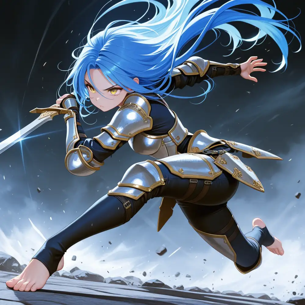
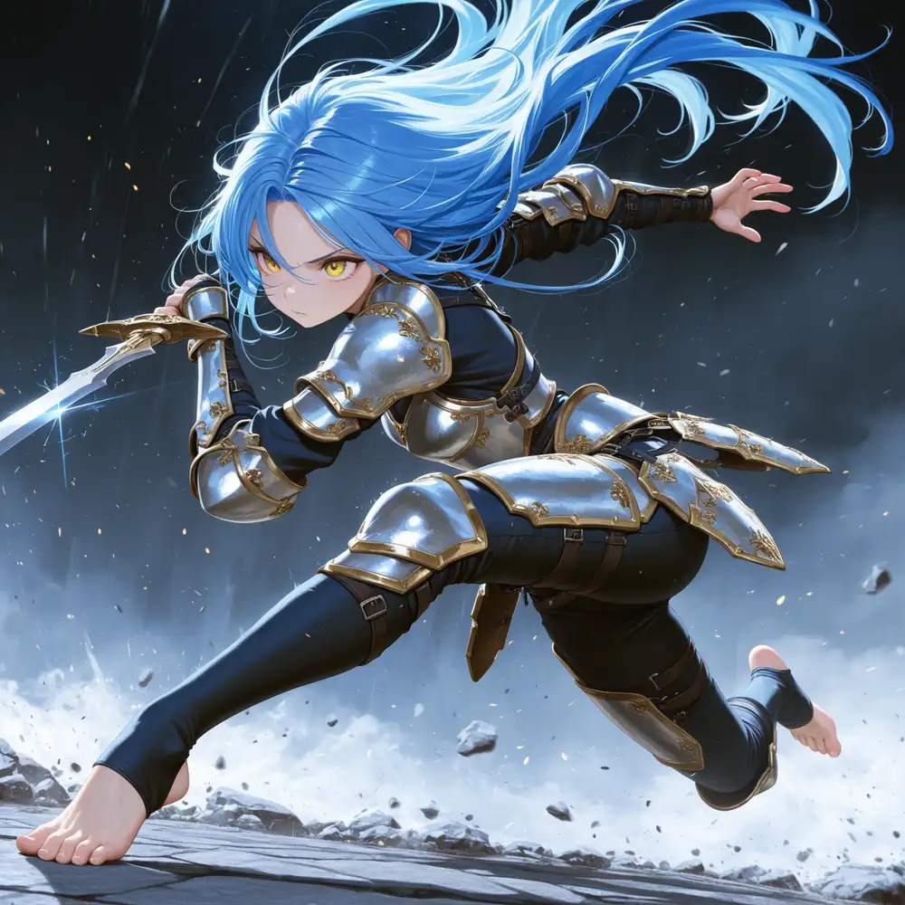
Composition, pose, and hair flow are preserved; only the details sharpen.
- Hand gripping sword → fingers are ambiguous at off, joint/grip relationship is clear at on
- Open hand → fingers melt together at off, articulated at on
- Bare front foot → toes ambiguous at off, toes/nails crisp at on
- Armor → rivets, gold trim, and engraved patterns become visible at on
- Hair → individual strand flow and texture emerge at on
- Background → rock and debris outlines sharpen, frame density increases at on
One minor side effect: the off version has larger, more intense eyes with stronger pupil highlights — the glare packs more weight. With denoise 0.4 applied in the 2nd pass, the entire face is “smoothed,” and the anime-style eye emphasis fades a touch. That said, the on version is better overall; detail density generally wins out over glare intensity.
“Automatic limb correction” is not marketing hype — it actually looks like the claim.
Hires fix roughly doubles generation time (66s → 127s), but it’s worth it for compositions where hands and feet matter.
Once on v17, reaching for hires fix by default is faster than grinding detailed hands, detailed feet into the prompt.
WAI-IL has long had a reputation for “noticeable variance between versions,” and v17 fits that pattern. Rather than a strict superset of v16, it’s a separate model whose style leans a bit cleaner. Outputs drift meaningfully at the same seed, so expect your curated seed collection to stop producing “the usual picture.” If you prefer v16’s look, keep v16 installed.
That said, output quality isn’t bad. The combination of (1) v16 LoRAs working as-is and (2) hires-fix limb correction being genuinely usable is reason enough to move. As an aside, since I already have the training assets, retraining the LoRA on v17 seems worth doing. Even though v16 LoRAs work, the base-model reinterpretation (v17 leaning to sailor uniforms) means a v17-trained version should produce noticeably different results.
M1 Max 64GB hits ~66s raw and ~127s with hires, so Apple Silicon alone is enough to try this.
Bonus: NSFW activation behavior (v16 vs v17)
From here on is the NSFW-leaning test. Checked whether there’s a version-to-version difference in how obedient and how aggressive the model is on the NSFW side. The images below are gaussian-blurred for Google’s sake. If NSFW isn’t your thing, you can stop reading here.
nude alone
Prompt: 1girl, solo, long black hair, blue eyes, nude, standing, bedroom, indoor, masterpiece, best quality, amazing quality
Both undress readily with just nude.
Pose and bedroom background are essentially the same under the shared seed.
v17 has smoother skin gradients and shading plus cleaner facial structure.
The undress threshold itself appears unchanged between v16 and v17.
Looking at them side by side, v16 has a subtle perspective mismatch between the bed and the character. The bed’s depth direction and the floor perspective at the character’s feet don’t quite align; the space feels slightly off. It’s unobtrusive in isolation, but next to v17 the latter clearly reads as furniture, floor, and character inhabiting the same space.
Unexpectedly, v16’s chest rendering is more modest here. WAI-IL’s default tends toward larger sizes when left to itself, so v16 landing below v17 on this prompt was surprising. The base-model parameters may have been re-tuned, but one sample can’t tell you for sure.
Explicit tags
Prompt: 1girl, solo, long black hair, blue eyes, nude, breasts, nipples, pussy, spread legs, lying on back, bed, bedroom, indoor, explicit, masterpiece, best quality, amazing quality
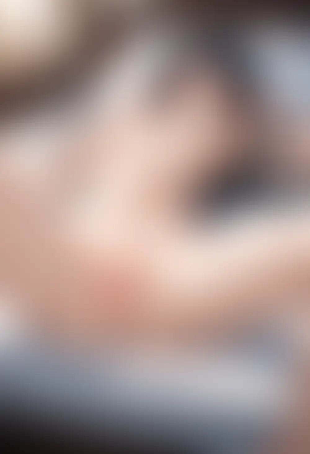
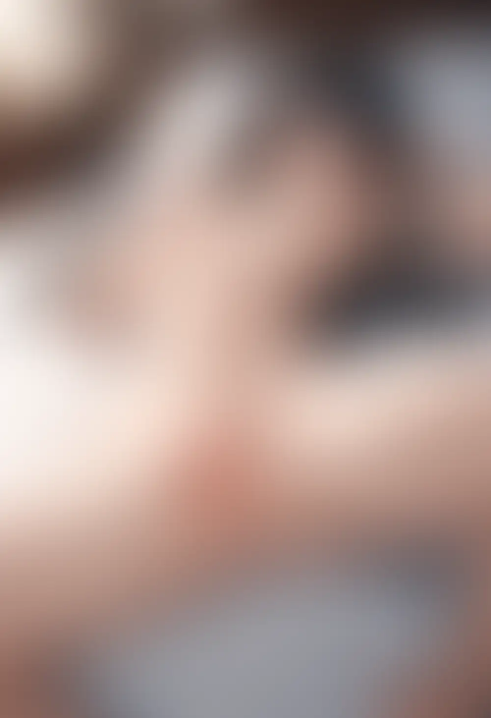
Both versions produce the composition as directed. Looking at expression first, v16 is almost flat while v17 has a light blush on the cheeks; the image reads better as a finished piece on v17. Difference also shows up at finger/hand/arm–body contact points and in the bedding overlap, with v17’s hand lying more naturally along the body. Overall anatomical consistency also improves in v17.
One bias note: in both cases, even though the subject is lying on her back, the chest isn’t flattening or falling to the sides naturally. Real-world supine breasts spread laterally under gravity, but v16/v17 both keep them perky and pointing up. Probably because the training data — anime/illustration sources — consistently ignores that physical behavior. That’s where these models diverge from photoreal models trained on 3D-scan-like datasets.
Obedience is unchanged between v16 and v17. The difference is finishing polish. Because rendering accuracy improves, v17 holds up better as an image even on the NSFW side.